 Log in


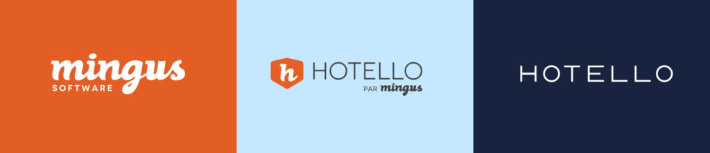
Becoming an elegant and humane brand image
With over 20 years of experience in an evolving industry, it was time for us to rethink our brand image in order to adapt it to our customer-centric and customer success positioning.
A new brand image doesn’t only mean changing your logo! It’s a set of elements that make you discover your personality, including its voice, tone, character traits, intention and energy. From all the ideas generated, we have retained the elegance, the technology, the humanity and our passion for the hospitality industry.
Why did we choose these criteria? Elegance is an important element for the hospitality industry. Therefore, we wanted to use it to pay tribute to hoteliers and help them find themselves in this new branding. This touch of elegance helps us stand out from other technological solutions. Regarding the technology, we wanted to highlight it differently. Thus, the main objective was to find the balance between elegance, avant-gardism, humans and technology.
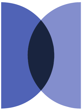
One circle, many possibilities
Chief symbol of Hotello, it doesn’t only designate collaboration and equity, but puts the focus on the relationship between Hotello and its customers. The circle also refers to the fact that Hotello encompasses all the functionalities required for hotel management and symbolizes a window through which everything happens. It is not an ordinary form; it can be combined with several elements such as photos, materials, refined, warm or patterned textures.
Throughout our rebranding process, we kept in mind the motto “Less is more”, which suggests “The less there is, the more we see”. The result was a simple brand identity, equally elegant and humane.
An elegant and refined logo
Our logo is the main element of our new brand image. We wanted it to be refined, easily readable and recognizable though its shape and purity. Its simplicity allows it to be associated with a vibrant design without overloading it. Furthermore, simple details such as angles, curves and perpendiculars add a touch of subtlety to Hotello’s logo. Its geometric balance contributes to its refined and balanced appearance while still being simple. Using an animated logo, why not? The movement is a strong advantage of our design and it allows us to stand out.
A symbolic icon
Once again, we wanted to highlight the liveliness and vibrant side through movement. To do so, our static or animated icon symbolizes the complementarity and the crossing between two circles. There are several explanations for this crossing. The first idea is that these two circles represent the relationship between the hotelier and its guest. The third entity designates Hotello supporting this collaboration. The second idea is that these two distinct circles illustrate technology and humans and that Hotello makes it possible to combine them. Finally, the icon can also symbolize the H for Hotello.
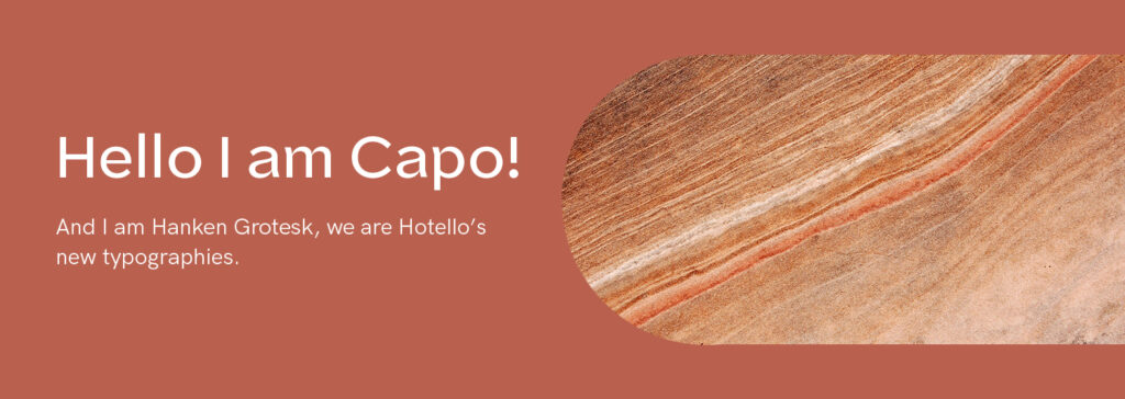
Typographies accentuating the contrast
Regarding Hotello’s typefaces, we chose Capo and Hanken Grotesk to highlight the typographical contrast which is one of our brand identity’s strengths. We wanted to enhance some perceptible details in our titles and keep a touch of originality in our typography in order to remain simple but remarkable.
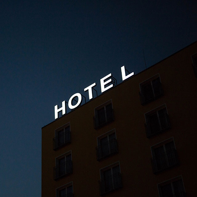
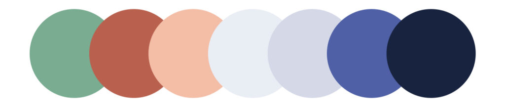
Living colors echoing the hospitality industry
Inspired by real elements echoing the hospitality industry, Hotello’s Sepia and mauve color range represent life and elegance. The warm colors highlight the humane side and the cold colors represent the technological aspect.
Thus, the colors chosen bring a lively and vibrant side to our brand image and they share a strong emotion.
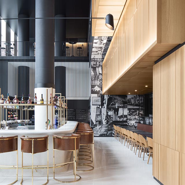
Paying tribute to the hospitality industry
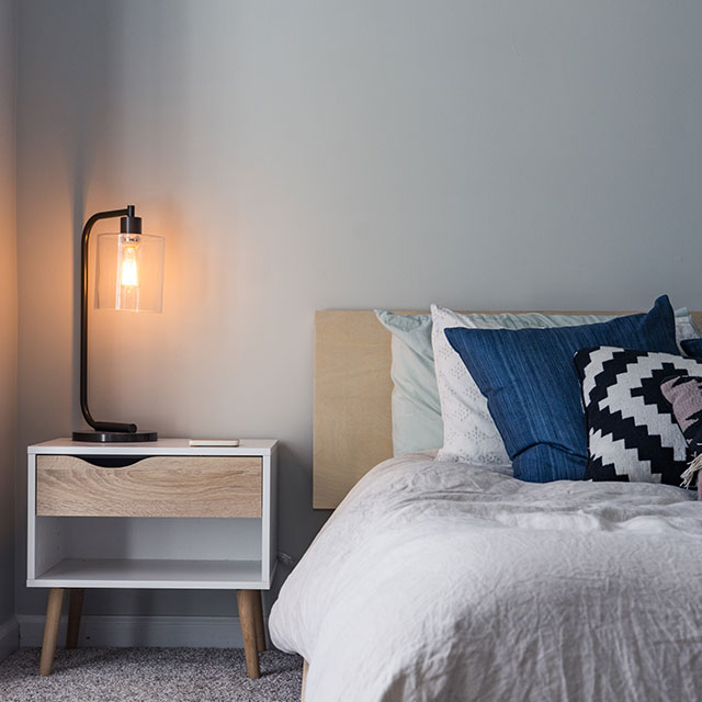
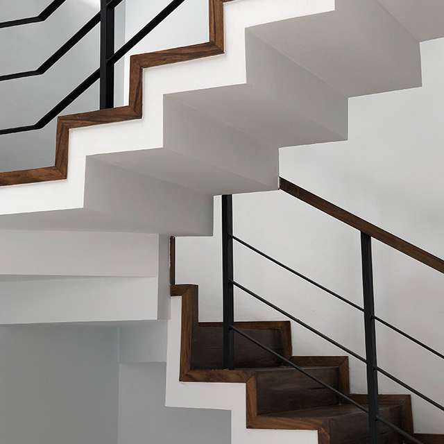
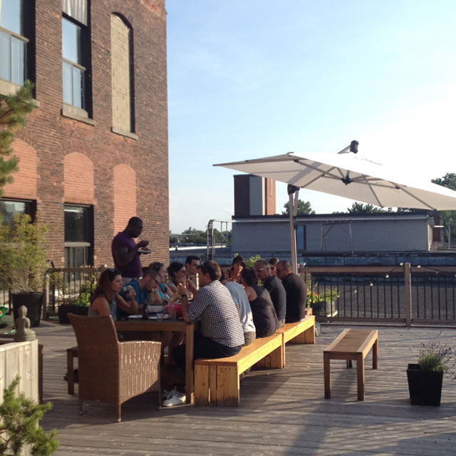
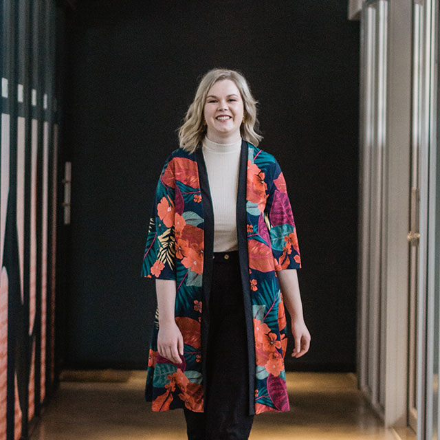
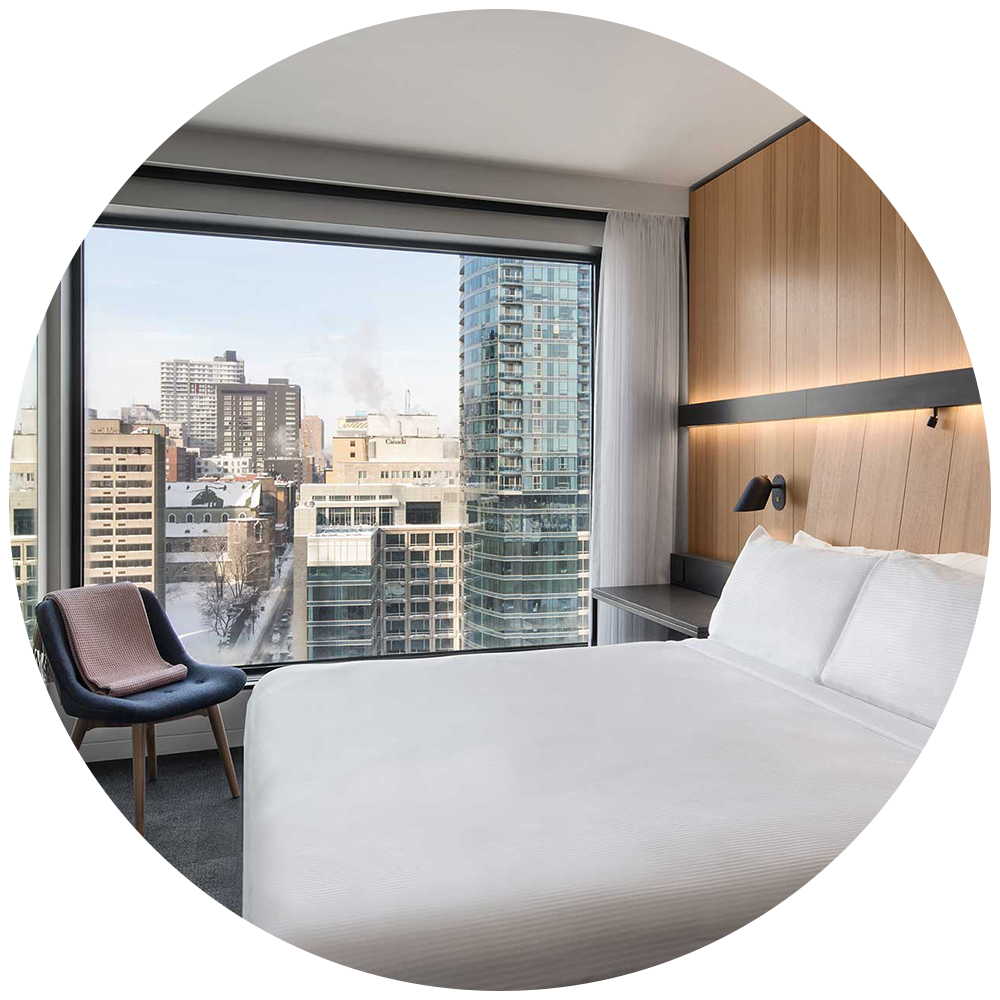
The relationship we have with our customers is precious and we wanted to pay tribute to them. By using representative images of our customers and their properties, we showcase their energy, diverse personalities and their passion for the hospitality industry.Textures are also an important part of our branding, they symbolize the humane, real and alive side of Hotello. Also, it helps combine technology and reality.
The most important thing for us was to echo hotel design and be able to adapt to our different targets.
Because your priority is hospitality
At Hotello, our team of hospitality specialists are dedicated, available and attentive to our customers. We support them on a daily basis so that they can offer the best experience to their guests. Also, we aim to become an influencer of tomorrow’s hospitality industry and we want to equip hoteliers so that they can create a memorable guest experience that goes beyond expectations.
Our product is our pride and the result of a strong collaboration with our specialists as well as our partners. Hotello is a cloud-based PMS and its customer service represents a strong value. The elegance in its design and the performance it offers creates an adequate technology hub so that different types of establishments can offer their customers an exceptional experience.
Our solutions are developed with reliability and adaptability according to hoteliers’ needs. It is based on observations and collaboration in order to respond to the latest hospitality industry trends. Humans are at the heart of the development of our solutions in order to make their work simple, efficient and enjoyable while reducing manual tasks. This allows them to have more time for what matters: be present for their guests.